I joined my A Cappella group my freshman year, and during my second semester I was lucky enough to inherit the role of web designer and PR manager! I’ve had this role for about two years now, and I have made significant strides in improving our online presence. I love music and I feel so lucky to get to use my creativity not just to sing with my group, but also when updating our website and creating promotional materials for our social media!
When I inherited the old website, the main thing our president told me is that she didn’t believe it currently captured the aesthetic of our group. I decided to conduct some interviews with our current members, and find out what words and feelings they associated with our group. Here’s what they came up with:
Inclusive
Silly
Close knit
Creative
Friends
High energy
Trendy
Cute
Talented
Supportive
The old website didn’t embody our group aesthetic - while looking at it, I really wanted to focus on changing the font, including updated pictures, and making the site have a more modern look overall. I liked the current site map, but wanted to improve the site visually.


Competitive Analysis
I researched other a cappella websites on campus to gain some insight. I identified some key facets of a successful student org website, including student centered home pages, effective promotional materials, and personalized pages for each member.

After analyzing these sites, the following UX requirements guided my design:
Including more images on our home page so our group was identified immediately by the user
Including abilities to connect with our group and hear our music more easily
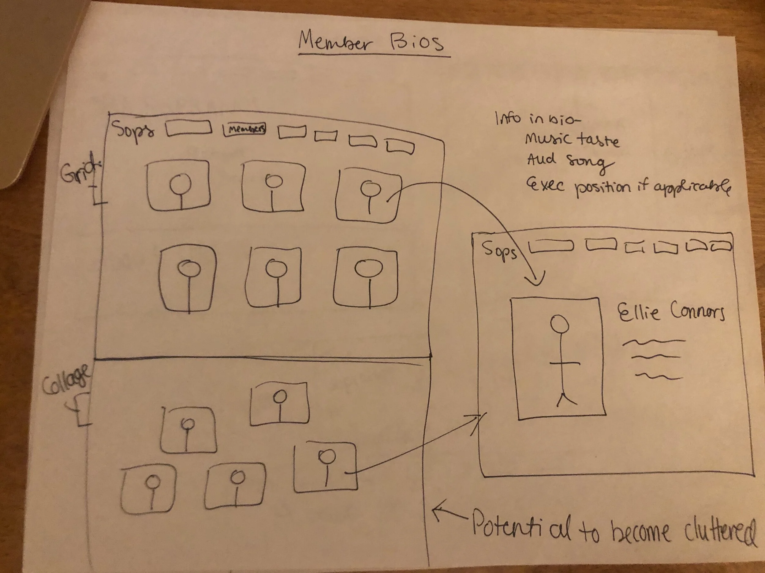
Including specialized profiles for the individuals in our group
Design
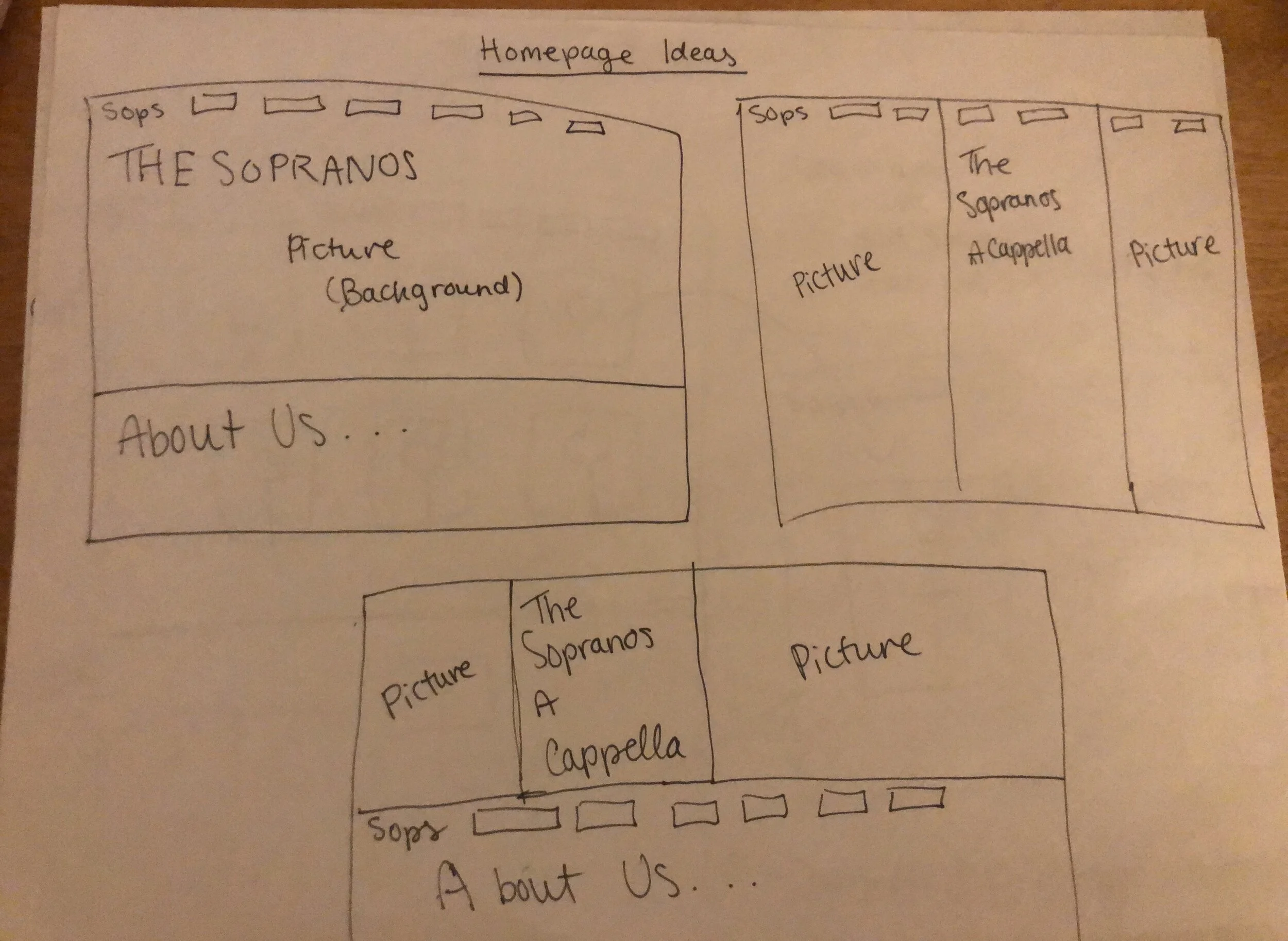

I started sketching and brainstorming both in terms of content and layout to help reach the UX requirements I previously set.
I started developing the site and received feedback from family, friends, and members of the group as I worked.

Here is one of my first tries at designing the home page, and here’s some examples of feedback I received:
Feels cluttered - I like the pictures but it’s hard to know where your eye should be drawn
I feel like the header and main content are disconnected
I think the Members section should be a more accessible tab
I continued my design process and implemented these updates based on the feedback I got:
Choosing two fonts to use throughout the site to bring continuity to the site
Putting the Members section within our About section so it is more accessible
Creating a cleaner main heading with only one image so the user doesn’t feel overwhelmed by content
Working within a predetermined color palette for a cleaner look


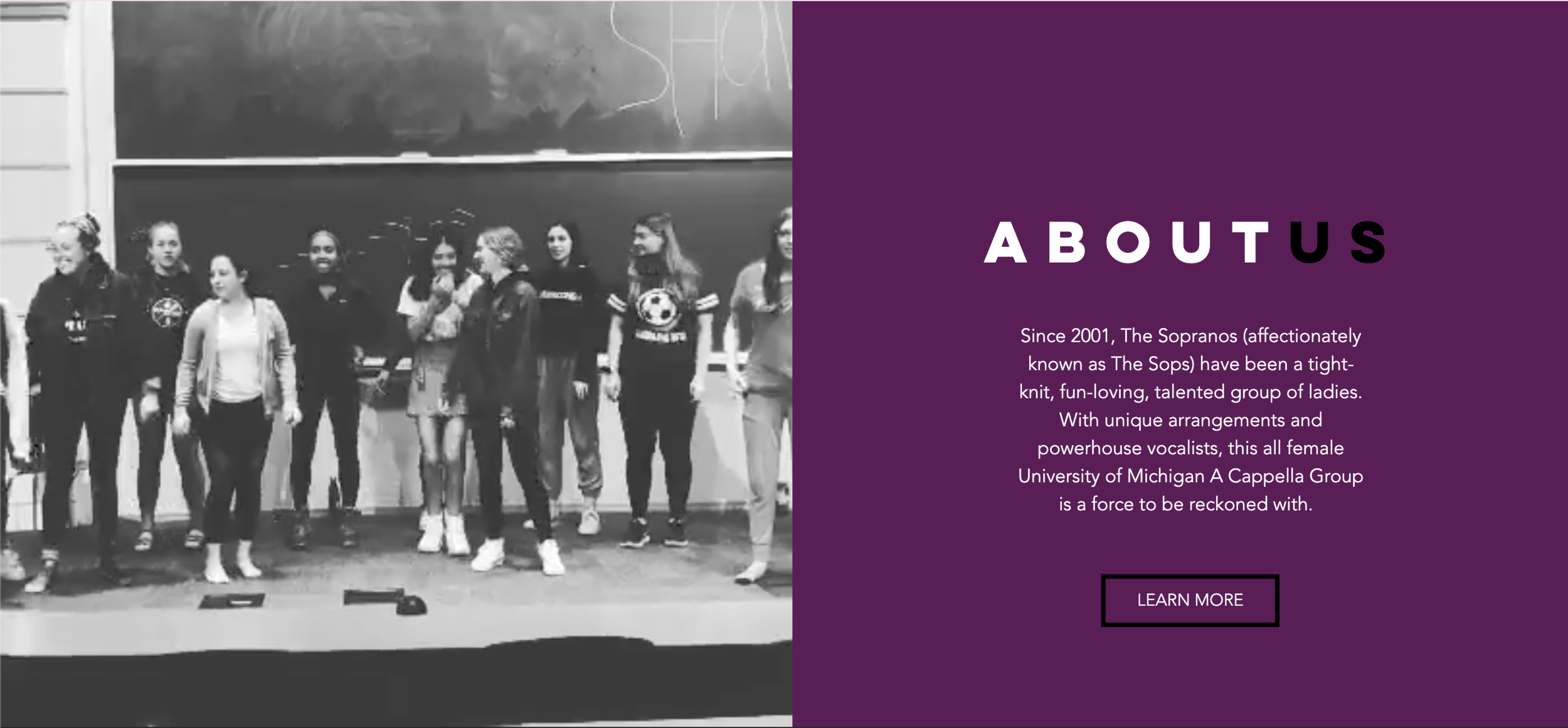
I thought this beautiful design, created by one of our members, Mia Turco, would be perfect for the home page. I created a color palette based on the design and incorporated it throughout the site to maintain cohesion!
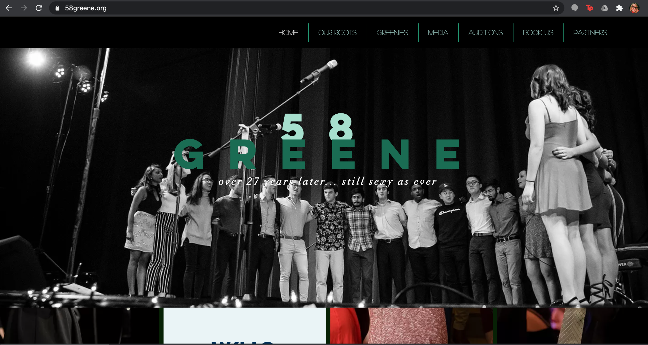
The Final Product
The updated website was much more inline with us as a group - modern, cool, and visually appealing. It enables users to interact with and understand our group better by highlighting our personalities and talents both on the homepage and throughout the site. Check it out here!


“The new website automatically gives off our vibe - fun loving, welcoming, and inclusive. The website is much easier to look at and interact with, which is exactly the energy we want to give off to prospective members!”
-Current Sopranos President
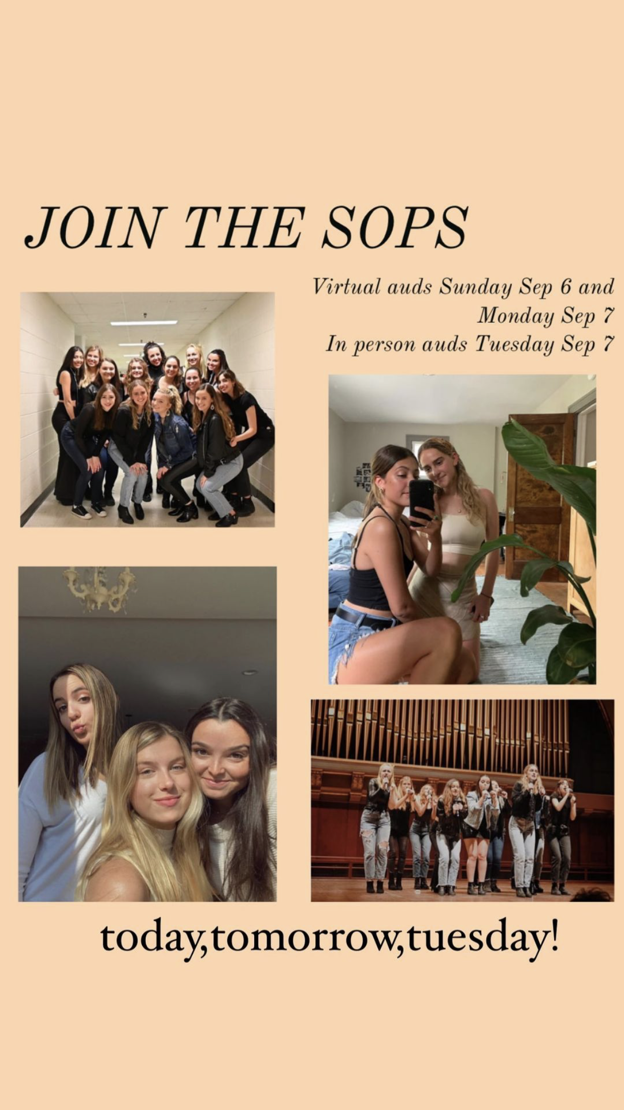
Other Social Media/Design Work