SI 482: Interaction Design Studio is an upper level course at the University of Michigan School of Information that teaches methods and skills to design and prototype interactive systems. The course covers the design process from the initial formulation of a design problem to creation of digital prototypes. At the onset of the semester, I was put with a team of three other students, and we spent all semester working on our application, GEMS.
Travel websites and apps are often created for highly technically literate users, leaving out many users who may want to travel and explore their communities. GEMS is a personalized travel app targeted towards users 35+ who want to make quick and easy travel and event plans. Our mission with GEMS is to encourage users to spend less time researching and more time exploring hidden gems.
I feel so grateful for the opportunity to engage in the research and design process for this product, and I”m eager to share our work below!
Step 1: Design Problem Statement
You can find our problem statement linked here.
Our group began with an exploratory brainstorming session to determine what design problems we saw in our everyday technology and lives. We found ourselves talking about experiences traveling, and how we always trust our friends and family’s recommendations to find the best spots. We agreed that getting a list of the best places from someone familiar with the area often fares better than going through the cumbersome process of researching online. We talked about how people who were less technologically savvy would probably have an even harder time navigating some of these online spaces when planning a trip. All of these thoughts and more contributed to our overall design problem statement, and we were on our way.
Step Two: Competitive Analysis
Next, our group conducted a competitive analysis to look to other similar apps and products, reflecting on them in a hope to better inform our own research. We began by listing five target activities for our solution:
Connect people to local attractions by adopting AI-based travel itinerary generators and geolocation services.
Reduce travel planning time with personalized travel recommendations that match each individuals' travel style.
Help users to make travel decisions through reliable user reviews of local experiences.
Support neighbor connection by adding social elements, such as messaging and friend features.
Include people with low digital literacy skills through voice interaction services.
With these activities in mind, we chose to analyze two direct competitors, Yelp and Airbnb, and two indirect, Netflix and Instagram. You can find our analysis linked here.

Step Three: User Interviews
After doing some preliminary research, we wanted to conduct interviews to make sure we were on the right track. To the left, you can see the baseline questions we used to conduct these interviews. Each of our group members facilitated three interviews independently, and we then came back together to discuss our findings. You can find my individual data here, as well as our group findings here.
Findings:
After conducting primary user research, these were some of our key themes:
ONE: Individuals like to refer to their friends and family when it comes to travel.
“I get frustrated when I just look up something like “things to do in Ann Arbor”, because usually, the most touristy, kitschy stuff comes up first. I don’t have a lot of faith or trust in random people’s reviews because their interests and tastes could be extremely different from mine.”
Although my interviewees all agreed that they have used reviews on sites like Expedia, TripAdvisor, Airbnb, and Yelp to help them plan a day trip or vacation, they also agreed that getting a recommendation from someone they trust is really helpful when planning.
TWO: Planning for trips takes a lot of time and is something you get better at with experience.
“I’ve amassed a lot of information from traveling for business for many years, so now I know which days flights will be most expensive or how to best navigate the airport. I think it would be a lot more stressful to book flights without the knowledge I have.”
Participants acknowledged that this kind of preparation and knowledge is something they’ve amassed over many years of traveling, and not everyone immediately would know the “ins and outs”.
THREE: People are overwhelmed with too much choice, both when it comes to travel resources and other apps.
“I honestly don’t love the browsing features of Hulu or Netflix because more often than not if I go in to browse I end up not watching anything. There’s just too many options, and I feel like I need more constraints. I get stuck in decision paralysis, because what if I start this show and it’s not actually good or funny?”
A large reason why planning these trips takes so long is because users can become overwhelmed with all of the options at their disposal.
Step Four: Creating Personas
Based on our user interviews, our team then went on to create personas to reflect possible users of our product. We created two primary and two secondary personas, reflecting the two types of user groups we anticipated having - travelers and hosts. Our created personas can be found here.
Step Five: Creating Scenarios and Storyboards
We additionally wanted to create scenarios for our personas to take a deeper look into our users and the decisions they will have to face when planning a trip. The goal when creating these scenarios was to bring realistic detail to these people that allow us to connect and learn about the user’s activities, lifestyle, frustrations, and goals, which in turn improve the development of our app.
Our created scenarios can be found here.
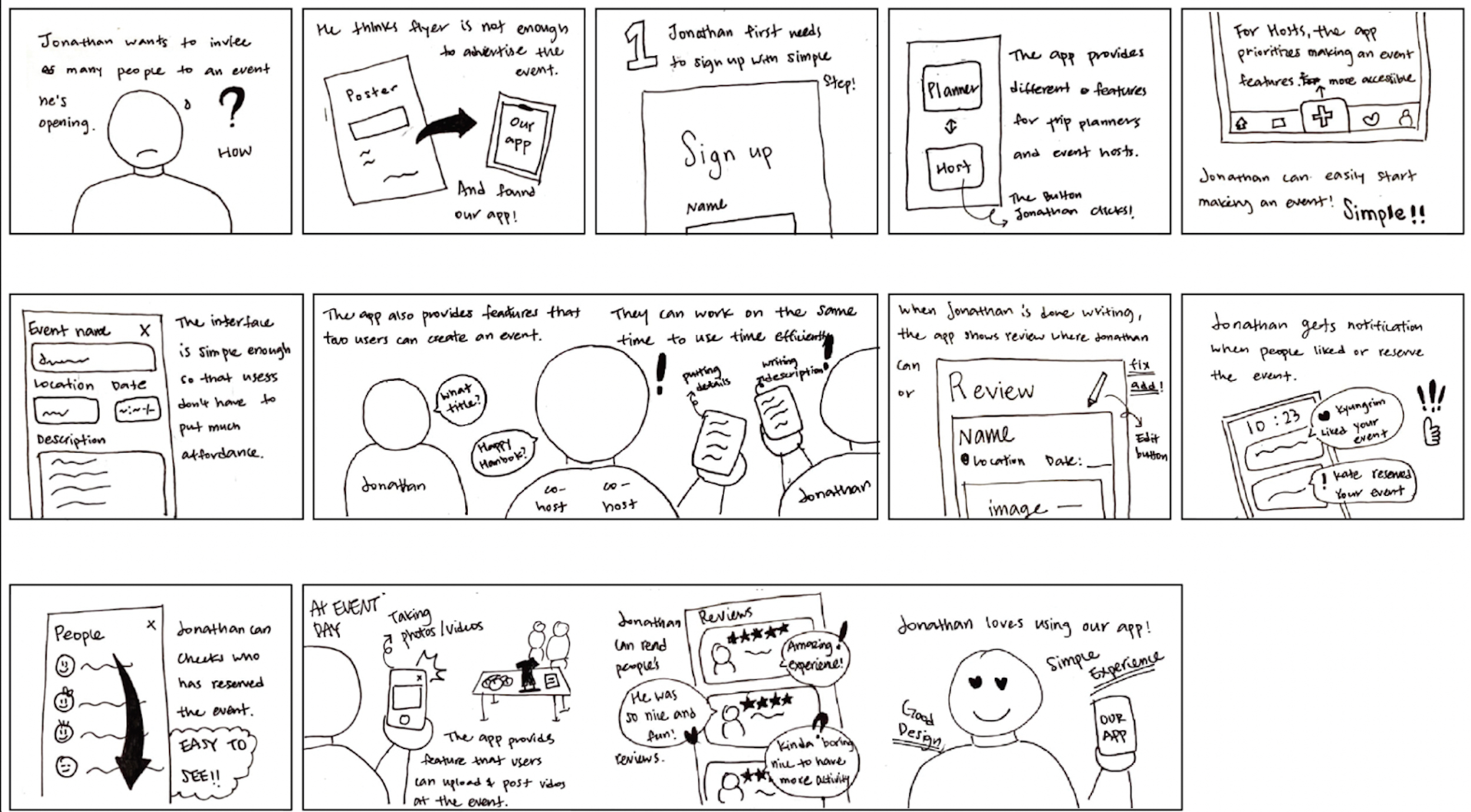
Additionally, we created storyboards to have a visual representation of our scenarios and further contribute to building empathy with the user. The storyboards can be found here.
Step Six: User Flow Diagram
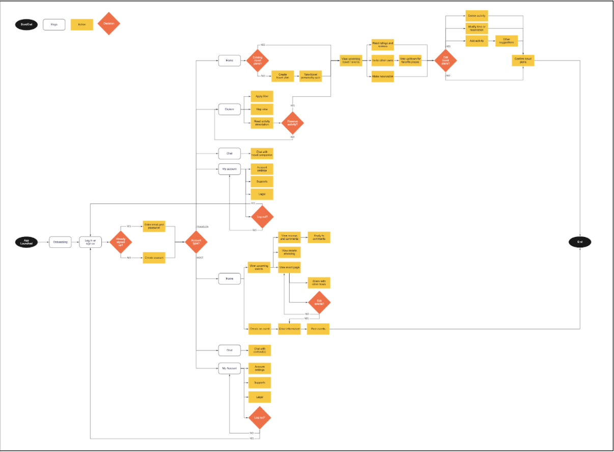
After the completion of our storyboards, we began to move from the research phase of our process into the prototyping stage. This is where we began to truly sketch out the vision we had for our product and how users would navigate through it. Our first step in making this vision come to life was the creation of a user flow diagram. Full details of our sketches, brainstorming, and final diagram can be found here.
Step Seven: Paper Prototype
Our next task was the creation of paper prototypes. Our team went through our sketches, storyboard, and user flow diagram to determine which interactions we wanted to create for the paper prototype. Doing so helped prioritize and eliminate interactions that are not the most important to our app. We then sketched out these interactions and filmed the user flow to better visualize our eventual product. The video of the user journey through the paper prototype can be found below, while we outline our process in greater depth here.
After creating the prototypes, we also wanted to engage in some usability testing so we could receive some feedback on our initial layouts. We created defect logs that helped us identify three main areas of concern with this iteration. All logs and further details of our testing can be found here.
Creating an event interface (Host)
In creating an event interface, most participants struggled to find the correct icon for posting an event between the share icon on the top right and the post button on the bottom that requires scrolling down. Additionally, the participants failed to scroll through the event-creating page to access more options and the right button to post.
Account Page (Traveler)
The account page is where users can access personal information and switch account types between hosts and travelers. However, the participants faced the problem of navigating to change the account type, failing to scroll down the page and find the correct button. Instead, the participants pressed the personal information field to find a way to change the account type, resulting in more affordance and more extended time.
Reservation Page (Traveler)
The participants were requested to create a family travel plan and reserve a restaurant for lunch. During the planning process, the participants struggled to find the back button to access the previous page where they chose options to find places.
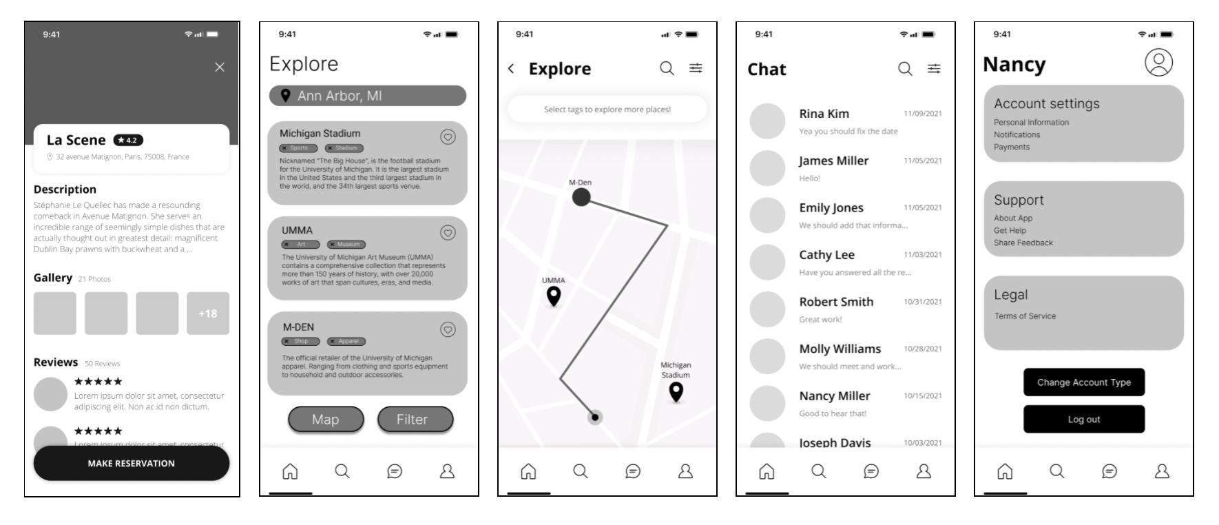
Step Eight: Wireframes
Our team then thought it would be a good idea to move to digital for our next iteration of designs. We created wireframes using Figma and would continue to use Figma for the remainder of our design process. All wireframes can be found here.

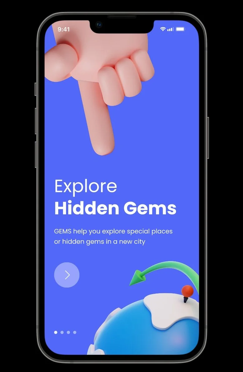
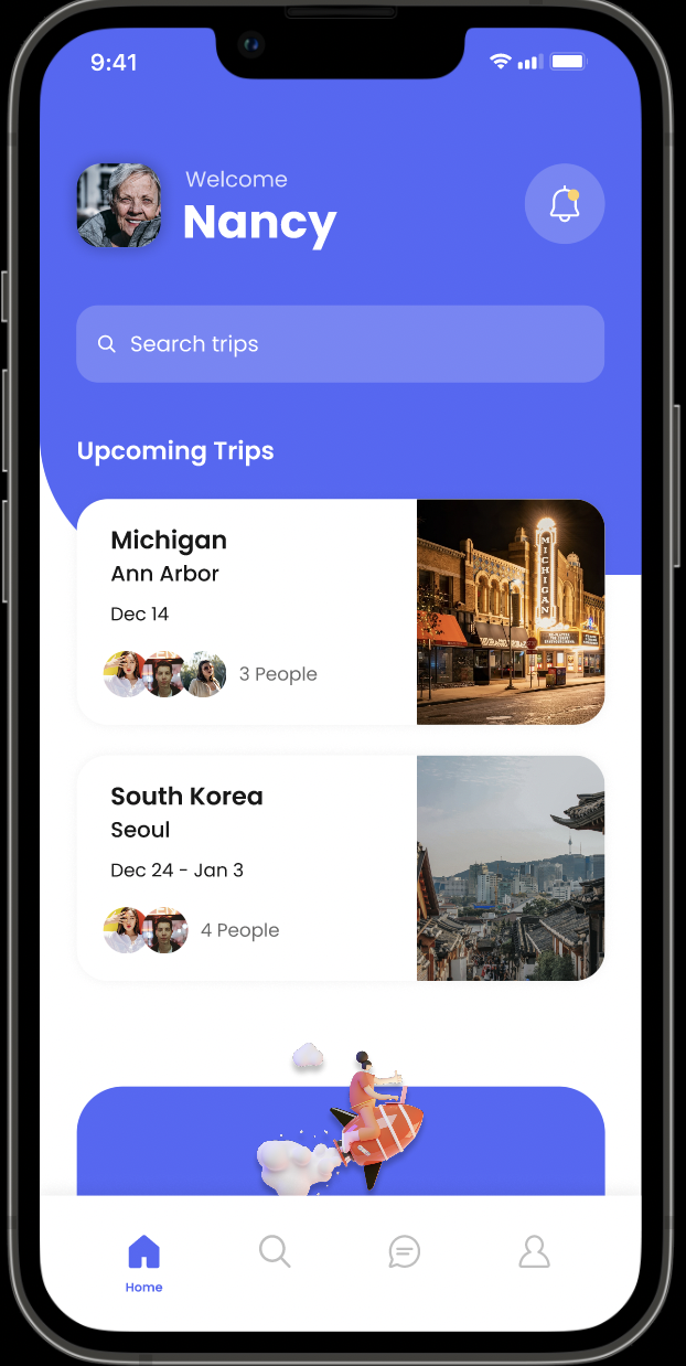
Step Nine: Digital Prototype
We updated our wireframes to include color, more interactions, and more detailed designs, and with that we had our first digital prototype. This experience really helped us solidify the user flows for both travelers and hosts who will be using our app. We now have visuals and interactions for the main screens of our product, so a user would be able to click through and navigate with the prototypes, which helps our understanding as designers on how to connect these processes. A video of all our interactions is linked to the left, while a report detailing our process can be found here.